A Refresh to Supercharge Growth
Yasui Architects & Engineers
Building relevance for the next 100 years
- Brand Strategy
- Brand Management
- Website
- Visual Identity
Founded in 1924, Yasui Architects and Engineers is one of the most respected architecture firms in Japan and in the world. The firm has designed some of the most iconic structures in Japan, including Tokyo’s Suntory Hall, the Kyoto Racecourse and the bullet train hub in Nagasaki.
For over 10 years, Eat has been one of Yasui’s key agency partners, supporting the firm in building visibility, prominence, and reputation both domestically and internationally. Our work focuses on developing the brand assets and communication tools that help Yasui leadership drive awareness and attract world-class talent. These elements are critical to their long-term growth, helping them win new business and remain competitive on the global stage.
Our corporate video for Yasui spotlights the principles that guide the Yasui approach to all its architecture briefs and challenges:
In 2024, Yasui celebrated its 100th anniversary which provided an opportunity to refresh the corporate identity and ensure Yasui’s relevance and leadership many years in the future. The primary goal was to honour Yasui’s legacy while signaling their future ambitions: embracing innovation, adaptability, and a global outlook.
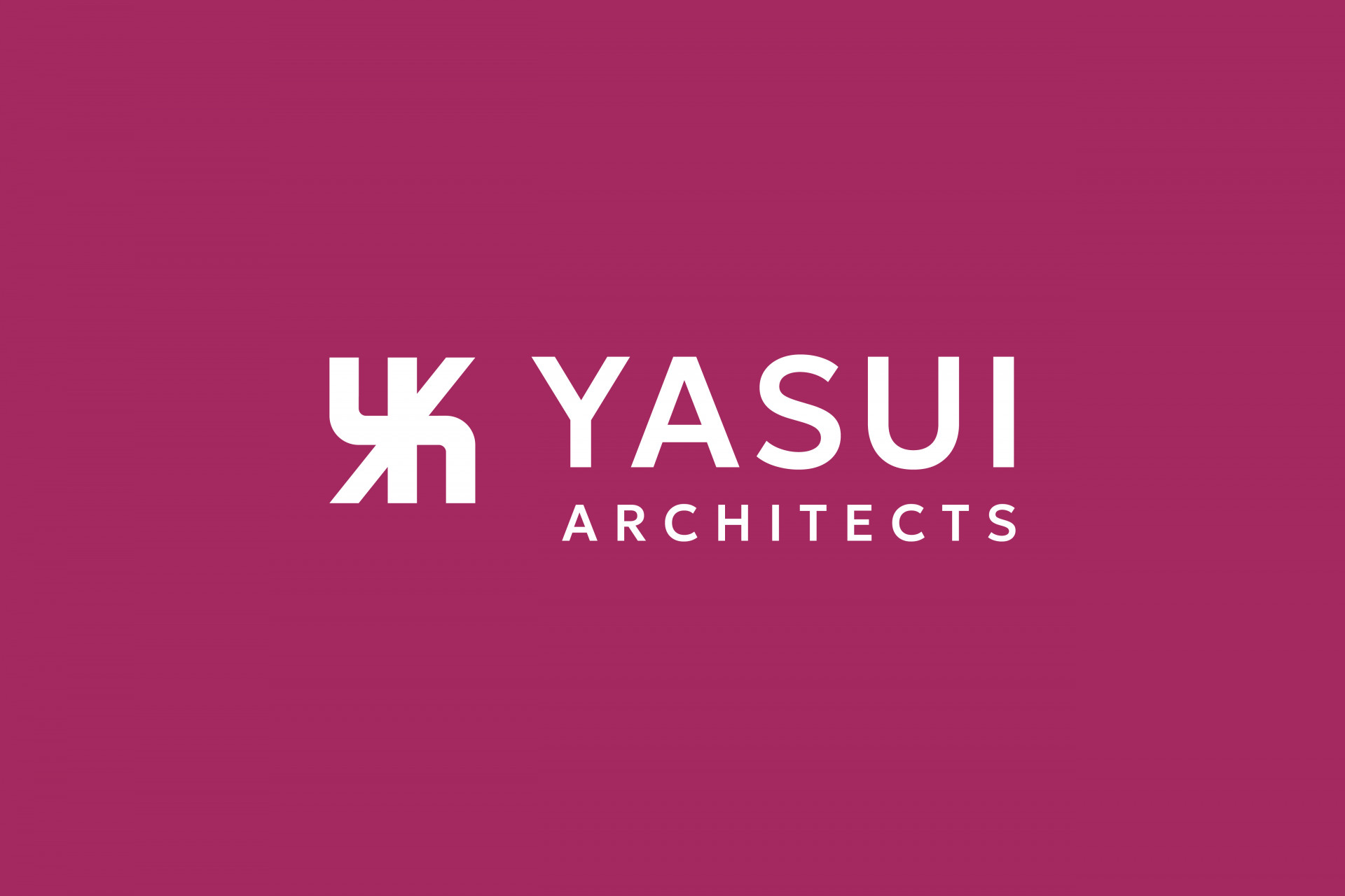
We led a comprehensive brand refresh centered on the theme of continuity and progress. One of the most visible changes was to move away from the long-time structure of a separate logo and wordmark for Japanese and English. This complexity meant there were risks of incorrect use and impacting the brand equity Yasui had built throughout its history. We simplified the system, providing a single logo and wordmark in English that together reflect Yasui’s expanding international presence.
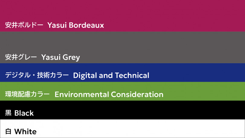
The primary corporate colour was updated from a traditional deep mauve, what the leadership felt was a dated, to a more vibrant tone that brings warmth, energy, and a contemporary edge to the overall visual identity. We also introduced a new set of secondary colors that more closely connect to key areas of Yasui’s corporate development—technology and the environment.
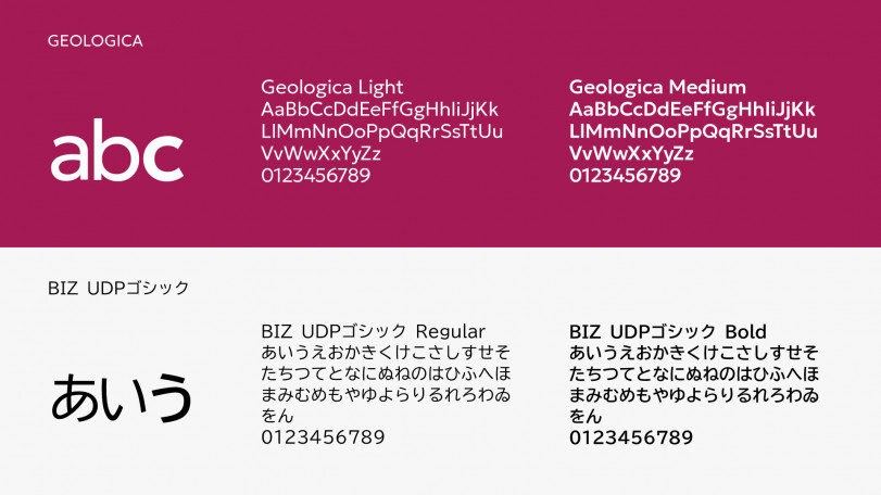
Typography also played a crucial role in supporting Yasui’s global brand development efforts. We implemented a clean, modern font system using open-source typefaces for Japanese and English, chosen for their readability but also balance that provides a distinctive yet consistent and cohesive look across languages and media channels.
As Yasui embarks on a new chapter in its storied history, we are working hand in hand with their teams to ensure the new identity is rolled out with consistency and deep understanding of what it means and why it matters. From website, to social media, to internal documents, to external print publications, this refreshed ambition and energy for Yasui will drive the brand forward in its next 100 years.
Eat Creative has a keen eye for the essence of our business and deep insight that has been nurtured over time. They have a wealth of experience and knowledge from a global perspective, and their approach adds clarity, freshness and always exceeds expectations. Eat Creative is a unique companion on this fulfilling journey.
Yoshihiko Sano
President & CEO
Principal Architect
Check out our implementation and execution work with Yasui here!