Creating a Brand for a New Era of Travel
CROSS Suites
Cross Paths, Share Stories
- Brand Strategy
- Copywriting
- Visual Identity
- Internal Communications
Eat partnered with one of Japan’s leading hotel operators ORIX HOTEL & RESORTS on brand strategy and identity development for several of its hospitality brands, including CROSS Life, CROSS HOTEL, and the Ryokan Collection. The latest addition to the portfolio is CROSS Suites, conceived as a sister brand to CROSS HOTEL and CROSS Life.
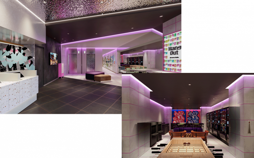
CROSS Suites introduces an apartment-style hotel concept, designed for today’s evolving travel patterns. With rooms accommodating up to six guests and equipped with kitchens and laundry facilities, the brand caters to families and groups seeking comfortable medium to long-term stays. The first property is scheduled to open in Asakusa, Tokyo, in July 2026.
As tourism continues to grow both domestically and internationally, casual hotels designed for group travel has increased significantly. In this competitive landscape, CROSS Suites needed a clear point of differentiation and a distinct identity. The ambition was not simply to position the new brand as “a hotel for large groups,” but to articulate and visualize a brand that responds to new styles of travel.
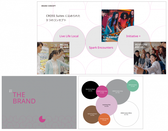
Eat began by defining the brand’s core positioning. The target guest is not seeking a passive, hospitality-led stay, but a journey where they step into the city, connect with others, and shape their own experiences. CROSS Suites was therefore conceived not simply as a place to stay, but as a travel hub where people, places, and stories intersect. From this foundation, the brand promise, supporting concepts, and hallmarks were developed to express how the brand comes to life.
The CROSS Suites logo features a cursive typeface that evokes connection and movement. Paired with a vibrant pink brand color symbolizing energy and activity, the design expresses the brand’s lively and unique personality.
Eat also developed Geoflow, a geometric pattern combining circular and straight lines. Inspired by the brand promise “Cross Paths, Share Stories,” it represents the intersection of people, cultures, and places. Designed for versatility, the pattern works as a flexible brand graphic across multiple communication touchpoints.
To support consistent brand expression and ensure clear understanding of the CROSS Suites brand, both internally and externally, we developed a comprehensive brand book and design guidelines. Working closely with the client and taking the realities of hotel operations into account, every detail was carefully refined.
Through a visual identity that balances familiarity with distinctiveness, CROSS Suites now expresses a clear and differentiated brand positioning, setting the foundations for success in years to come.