A Visual Identity Refresh
National Azabu
Evolving a Tokyo supermarket icon
- Brand Strategy
- Graphic Design
- Visual Identity
Founded in 1962 in Tokyo, National Azabu is a supermarket held in high esteem for customers. The shelves are lined with international brands and products – from Kellogg’s breakfast cereals, to Reese’s chocolate and peanut-butter cups, to Amy’s Kitchen pies. Their delicatessen and cheese sections are revered for their selection and difficult to find products. For many expats in Tokyo, it is THE supermarket, where they most feel “back home”. For many Japanese, a trip to National Azabu is akin entering a portal to the American lifestyle.
With National Azabu coming under the ownership of food, beverage and hospitality business Nakashima-To, it was time to take a fresh look at the brand. With a wide range of audiences and stakeholders involved – from shoppers, to supermarket staff, to the new parent company – we were tasked with defining an evolved story and identity for the supermarket. This would solidify the brand’s position as a premium shopping destination in the Hiroo area of Tokyo.
We began our brand programme with a comprehensive research phase – examining what the National Azabu brand means to its diverse audiences as well as benchmarking the story, identity and experience against competitors. We analysed shopping behaviours and needs, drawing out differences in expectation between Japanese customers and foreign residents. With five different segmentations to examine, our goal was to reveal a red thread that connects all of them that National Azabu could support long term.
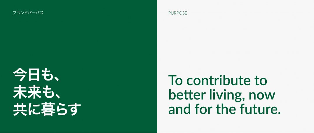
We took our insights into the development of an evolved brand positioning and philosophy. The brand would retain its position as a home from home for expats while providing an opportunity to discover new flavours and experiences. National Azabu would also be stepping up its social responsibility commitments, connecting people and cultures and creating a more tangible positive impact in society.
A key element of our work was managing the complex ecosystem of stakeholders, and consolidating a brand story that would drive alignment across the different groups and ensure a unified ambition for the brand moving forward. This was critical particularly as we moved into the creative phase, crafting a refreshed National Azabu look and feel.
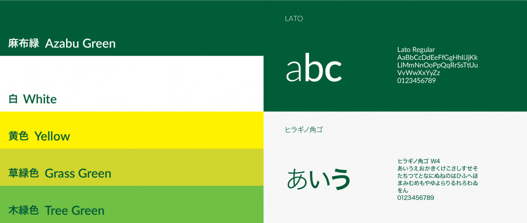
The updated National Azabu logo presents a sense of modernity and humanness. The color palette consists of a vibrant yellow and shades of green, staying loyal to the brand’s legacy of commitment to hospitality and exciting shopping experiences. It also works to convey the brand’s aspirations to promote sustainability, inclusiveness, and diversity.
Concept work
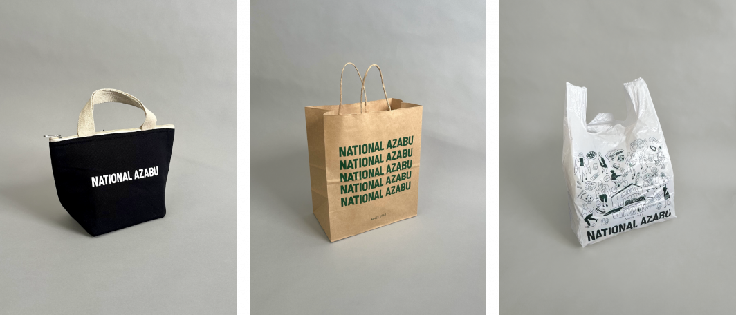
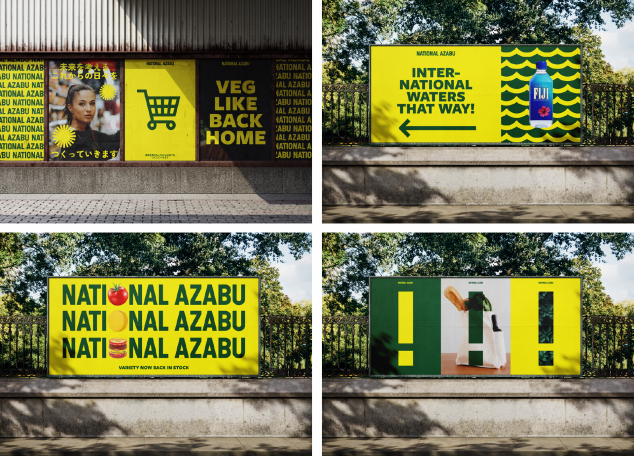
We applied the new visual identity to a wide range of touchpoints and collateral, including posters, signage and other communications. We took these into a comprehensive set of guidelines that will act as a north star for National Azabu teams to design and deliver assets that drive consistency and equity in the brand long term.
National Azabu is now rejuvenated to inspire curiosity and bring joy to shopping experiences for its customers in Tokyo.
You can also check out our previous partnership with Nakashima-To here – developing a visual identity for New Zealand-based winery, Folium.