Capturing the Seasons for the Shelf

In this series, Inside Made in Japan, we explore the stories, philosophies, and cultural influences behind some of Japan’s most distinctive products and services. From everyday objects to globally recognised innovations, we look at the values, thinking, and processes behind the finished products that make them uniquely Japanese.
Walking into a store in Japan, seasonal products greet you right at the entrance. In many countries, seasonal packaging revolves around major holidays: Valentine's Day, Halloween, Christmas. While these occasions are also important in Japan, packaging changes throughout the year to reflect not only cultural events, but the changing seasons and ingredients. Limited-edition packaging appears year-round across categories, from food and drinks to cosmetics and everyday goods.
Japan’s attentiveness to seasonal change is embedded in the country’s culture. The traditional Japanese calendar once divided the year into 72 micro-seasons, each lasting just a few days and named after subtle changes in nature, such as “east wind melts the ice” (東風解凍) and “first cherry blossoms” (桜始開). While people no longer follow these micro-seasons in daily life, a broader awareness of seasonality, known as kisetsukan, still shapes everyday culture.
It can be seen in kaiseki cuisine, where ingredients are chosen to reflect a specific time of year, and in long-standing gift-giving customs. It's reflected in the concept of shun (旬), the idea of enjoying ingredients when they are at their seasonal peak. Restaurants adapt their menus around seasonal produce, while food manufacturers introduce seasonal flavours and products throughout the year.
It's also visible in packaging, which doesn't just help sell a product but helps it belong to a particular moment in time. Seasonal packaging, in this context, is not just a marketing invention. It is an expression of a cultural awareness of the seasons.
A Visual Language for the Seasons
Japan has developed a distinctive visual language for communicating the changing seasons. Rather than relying on a text cue, packaging often draws on colours, ingredients, plants and cultural symbols that people associate with a particular time of year. Soft pinks and cherry blossoms immediately bring spring to mind, while fireworks, lanterns, citrus and lighter blues evoke summer. Autumn is expressed through warm oranges and browns, momiji and ginkgo leaves, as well as familiar flavours such as chestnut, sweet potato and pumpkin. Winter shifts towards traditional celebratory colours white and red, with winter fruits like strawberries and mikan.
These associations are so culturally familiar that they can communicate a season almost instantly. A single colour, ingredient or motif can be enough to place a product within a particular moment in the year. This creates a shared visual vocabulary between brands and consumers, allowing designers to signal seasonality without having to explain it.
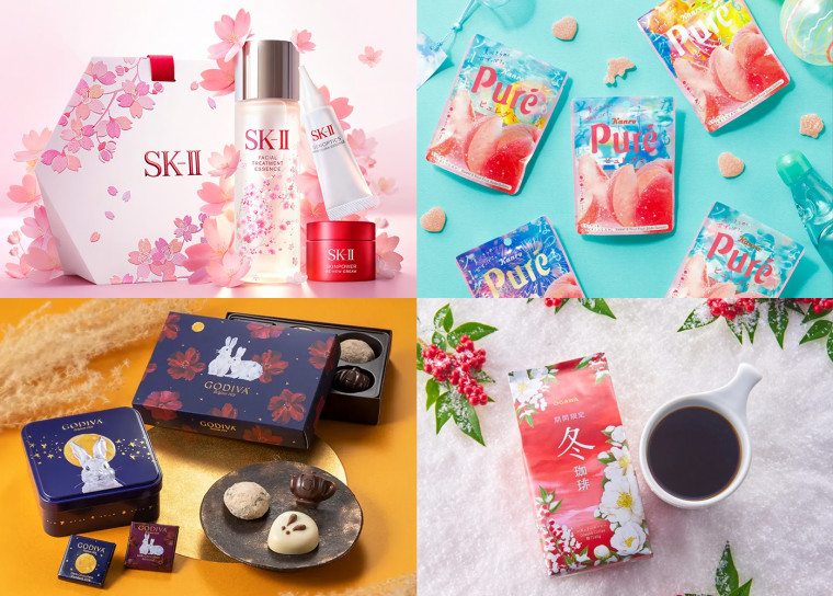
© SK-II / Kanro Co., Ltd. / GODIVA / OGAWA COFFEE
Seasonality Creates Relevance
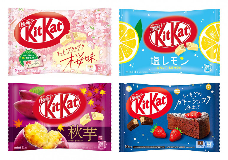
For established brands, staying relevant means giving consumers reasons to notice products they already know. Seasonal packaging offers a simple way to do this. A change in colour, pattern or imagery can give a familiar product a fresh presence on the shelf, without creating an entirely new product. Limited-edition sakura collections in cosmetics, seasonal KitKat flavours and limited-edition drinks are all familiar examples. The product remains recognisable, but the seasonal version gives consumers a reason to ‘re-notice’ it, try it again or share it with others.
© Nestlé Japan
A well-known example in Japan is KitKat. The brand regularly introduces limited-edition flavours inspired by seasonal ingredients, regional specialties and cultural moments. From sakura in spring to roasted sweet potato in autumn, these editions transform a globally recognisable product into something that feels specific to the time and place. During exam season, KitKat also leans into its association with Japanese phrase ‘kitto katsu’ meaning ‘surely you’ll win’, appearing in omamori (Japanese amulet) -inspired packaging that turns the product into a small token of encouragement and good luck. Each release gives consumers a reason to stay engaged.
The Psychology of Scarcity
Part of the appeal of seasonal products comes from both ritual and limited availability. When something is only available for a short time, there is a stronger reason to buy it now. This can encourage repeat purchases, create a sense of collectability and give consumers a reason to look out for a product’s return each year.
In Japan, this sense of scarcity is supported by an existing cultural rhythm. Seasonal transitions are already anticipated and celebrated, so the limited availability of a product follows a pattern that consumers are familiar with. Rather than creating urgency from scratch, brands can tap into an existing sense of anticipation and give it a physical presence on the shelf.
Making the Familiar Feel New
For designers, the key challenge is finding ways to make a product stand out among similar seasonal designs. Each year, they must consider whether to take a new approach while finding the right balance with the brand’s established identity. Big changes can be polarising and financially risky for established products.
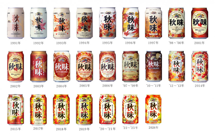
For example, Kirin’s Autumn Beer is a seasonal favourite for its richer taste, but the packaging is also part of its appeal. The design changes slightly almost every year, with some years looking noticeably different and others making you wonder, “Is this the same as last year’s?”
© Kirin Brewery Company, Limited.
Looking back through the designs there is an interesting evolution in the red gradient within the Aki Aji (秋味) lettering. Its position and balance went through variations until settling into its current form in 2017. From these subtle adjustments, you can imagine the designers trying to find just the right balance.
Other familiar elements have changed more dramatically: the barley that once featured prominently in the design has now disappeared altogether, while autumn leaves have become much more dominant. These shifts reveal how consumers understand the seasons.
While the harvest of barley is in late spring and early summer, this period is traditionally known as bakushū (麦秋, literally ‘barley autumn’), a poetic reference to the golden fields that resemble the colours of autumn. The disappearance of barley from the packaging could be seen as reflecting a broader cultural shift away from traditional associations rooted in agriculture and towards the more immediate, widely recognised imagery of autumn leaves. Kirin Autumn Beer packaging shows us that what feels seasonal is not necessarily fixed but also changes with time.
In Japan, seasonality is experienced through food, nature, festivals and everyday rituals. Packaging becomes part of that experience, giving familiar products a visual connection to a particular time and place. It also creates a sense of shared understanding, where consumers recognise the seasonal cues because they share the cultural references behind them.
For brands, this creates more than an opportunity for a seasonal refresh. It creates a recurring way to stay relevant, reengage consumers and build recognition without losing what makes the brand familiar. Each seasonal expression can become another touchpoint through which consumers experience and remember the brand.
Perhaps most importantly, packaging can do more than communicate what a product is. It can communicate when it is, giving consumers a shared way to recognise and experience the changing seasons.
Eat Team Recommendations
© Ryohin Keikaku Co., Ltd.
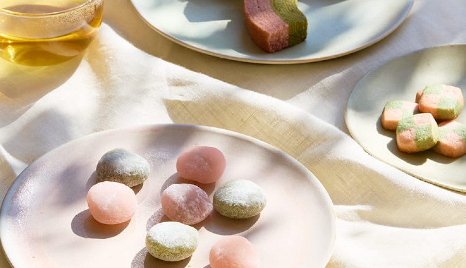
MUJI Sakura sweets- Kanako Fujioka, Project Manager
Every year during cherry blossom season, MUJI releases a range of sakura-flavoured snacks, including baumkuchen, cookies, teas and lattes. Alongside the cherry blossoms themselves, these seasonal treats have become a familiar sign that spring has arrived.
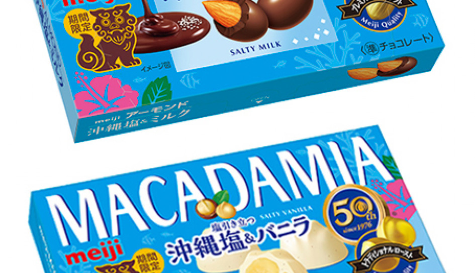
© Meiji Co., Ltd.
Almond Chocolate Crunch Okinawa Salt and Macadamia Chocolate Okinawa Salt & High-Quality Vanilla – Emilie Delarge, Art Director
Almond Chocolate Crunch Okinawa Salt & Milk and Macadamia Chocolate Okinawa Salt & High-Quality Vanilla both feature Okinawa salt as a key ingredient. The salt makes the chocolate more interesting, especially if you like a sweet and salty mix. The colourful packaging and Okinawa-inspired design add to the distinctly summery feel, making these a fun seasonal treat.
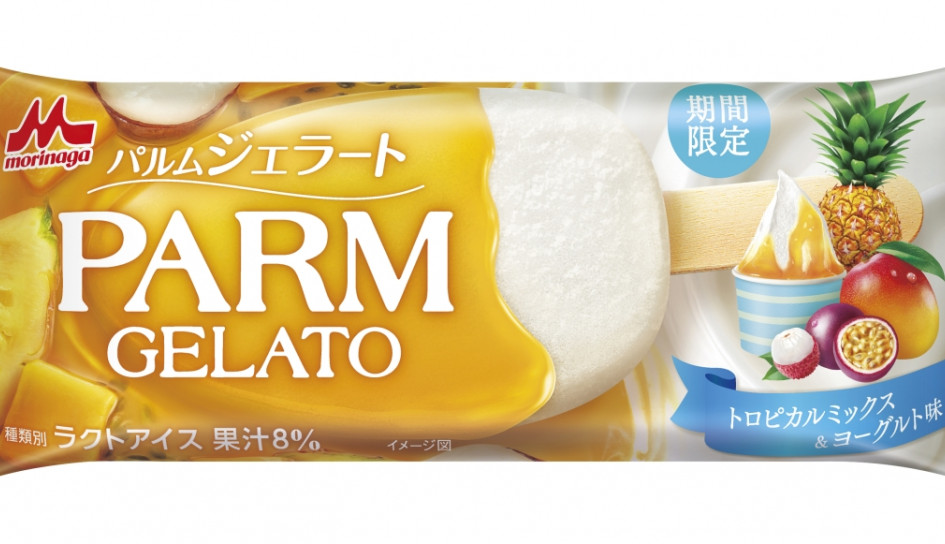
© Morinaga Milk Industry Co., Ltd.
Parm Gelato - Ami Frost, Design & Strategy Associate
Since 2021, PARM has released its Gelato range as a summer-limited product. In 2026, they introduced the Tropical Mix & Yogurt flavour, combining a smooth yogurt gelato with a tropical fruit coating. Ice cream is a great way to cool down in summer, and the tropical fruit flavour makes it even more refreshing.
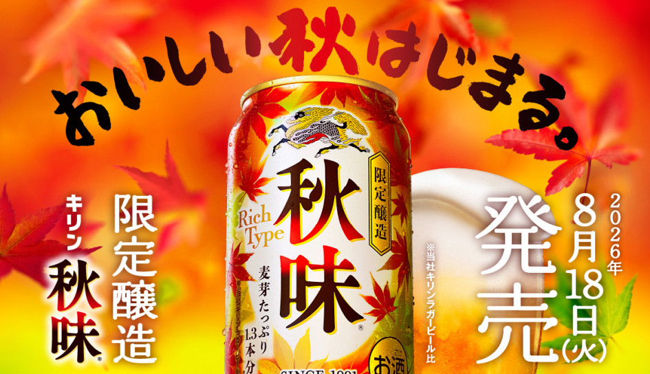
© Kirin Brewery Company, Limited.
Kirin Akiaji - Chiemi Suyama, Senior Designer
Kirin’s Autumn Beer is known for its richer taste and has become a familiar sign that autumn has arrived. This year, the autumn leaves on the packaging feel more prominent than in previous years, giving the can a particularly strong autumn feel.
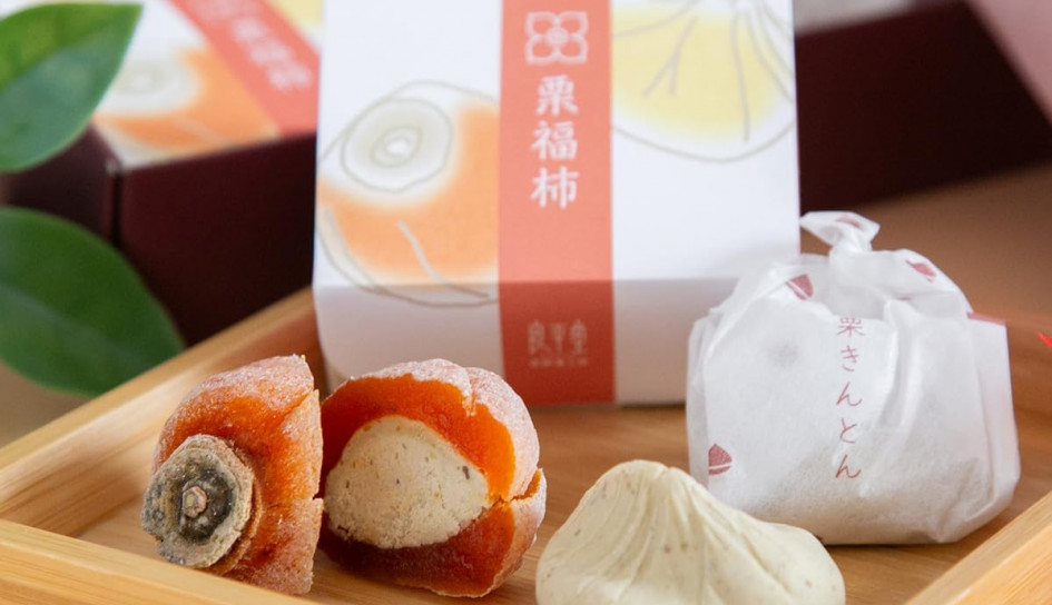
© Ryohei-do (良平堂)
Ryohei-do Dried Persimmon with Chestnut Kinton – Steve Martin, Co-Founder & Executive Creative Director
Ryohei-do Dried Persimmon with Chestnut Kinton combines semi-dried persimmon with chestnut paste, bringing together two classic autumn ingredients. Persimmons are a familiar seasonal fruit in Japan, while the semi-dried preparation gives this traditional sweet a distinctly Japanese feel.
© McDonald’s Company (Japan), Ltd.
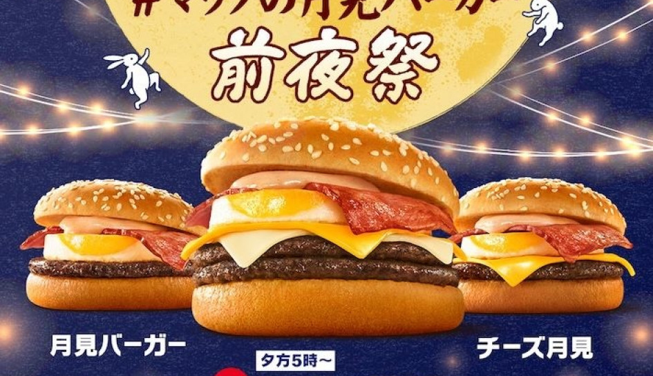
McDonald's Tsukimi Burger – Weijing Zhu, Strategist
McDonald’s Japan’s seasonal Tsukimi Burger takes its name and inspiration from tsukimi, the Japanese tradition of moon viewing. Made with a soft egg, creamy sauce, and smoky bacon, it has become a seasonal favourite. But the tsukimi concept goes beyond the burger itself. McDonald’s brings it into the packaging through familiar imagery like moon rabbits, full golden moons, and deep blue night skies. The result is a distinctive and instantly recognizable visual identity for this seasonal favourite.
© Toraya Co., Ltd.
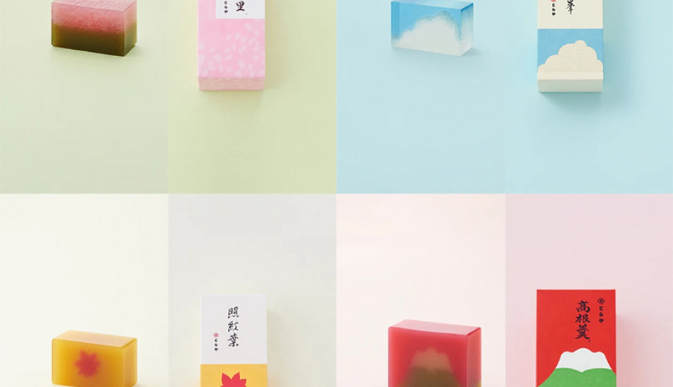
Toraya's Yokan - Ayako Chujo, Co-Founder & President
Toraya’s yokan adapt traditional Japanese sweets to reflect the changing seasons. Throughout the year, both the ingredients and designs shift to feature seasonal flowers, landscapes and cultural motifs, making them a thoughtful gift for the season.
If you enjoyed this piece, subscribe here to The Eat Digest - our monthly newsletter covering our latest insights, Japan brand and marketing news, and more.